Reading the GNOME Human Interface Guidelines gives a good idea on how to arrange elements and reduce complexity. The HIGs also emphasize on having a clear goal which helps in deciding which elements need to be arranged at all. But I did not grasp the wideness of being purpose-driven for this goal of the application which might then mean to abstract from technical details on the way. So now I try to explain this observation here.
I think there are two opposite paradigms one can follow in UI design, and thus what users can expect from UIs. This is not a thorough research on the topic, so you can leave a comment if you have insights to share on whether this view is mistaken. Maybe you will find your own examples during reading if you try to think about image, audio and video formats and their parameters, or network connection and encryption stuff in UIs.
The first paradigm is to make features accessible in the UI. This could just mean showing technical choices and configuration values coming from an API or command line tools. The UI serves as big toolbox with few limits, allowing to be creative and meet various use cases. But from the viewpoint of a newbie it is a big frustration to use these kind of applications because the options don’t have a meaning. Reaching the point where all implications of the parameters are understood is not possible in a few minutes. The whole research task for appropriate parameters has been offloaded to the user.
Therefore, the other paradigm comes into play and thinks from the main purpose of the UI and what elements it needs to reach the goal. That’s what I expect in GNOME. The technical details go to the background and may not be found as UI elements anymore. This needs clever ways to find optimal parameters, or studies of the technical and social/psychological conditions to reduce the workload for the user. First this looks like hiding ‘features’ and configuration options (i.e. technical details) but it might be good to take a step back and look at the state of IT. Is it really necessary that everyone fiddles around with the available technical options? Can the decision for a configuration value be automated or evaluated? And how did we get into the situation of having so many competing ‘standards’ and a rag rug of solutions for the different layers involved and all this strange legacy stuff needed for compatibility.
Maybe we first need to work on a algorithms, libraries and single standards in order to be able to reduce UI complexity. But it’s not always possible to find unique technical solutions for the whole planet and we have to expose some of this strange acronyms and abbreviations in the UI and hope that users have an idea of their meaning. The result is a mixed approach of both paradigms where necessary.
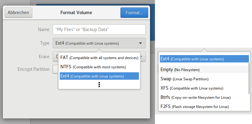
Example: The format dialog in GNOME Disks
In the specific case of the format dialog for pen drives or hard disks you could simply decide to make features of the command line tools available in the UI. This would involve to expose the choice of the filesystem type and if it should be contained in an ecryption layer. Not speaking of overwhelming non-default parameters this toolbox is already hard to understand. For the new design of the format dialog I first proposed this toolbox paradigm approach (even if preference of the tools is indicated and not all are directly visible):
Assessing every option for the given use case and conditions is a lot of work and sometimes a final judgement can’t be made concerning issues with inter-OS compatibility, snapshots, Linux file permissions, encryption and performance (storage type, in-kernel drivers). With the Opus audio codec joint efforts came finally to a good general solution, maybe too late. But for filesystems it’s much more complex and the operating systems also have significant differences.
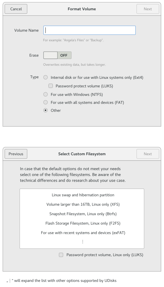
So if we want to use the result-oriented paradigm, we already see the problem that the UI has to guide the user through these OS compatibility issues. But this still means abstracting from selecting a concrete filesystem type and focusing more on use cases which are tied to filesystem choices (here still visible in brackets). The UI does not have to differ too much but important is the base idea. Here we see Allan’s design:

Ext4, NTFS and FAT are the current default filesystems in Disks but maybe exFAT is already more relevant and could e.g. replace both NTFS and FAT or even cover a distinct use case – that needs further research.
But also for Linux-only use cases there are other filesystems than Ext4 which could replace it as default choice or at least cover special demands like snapshots or being suited for flash storage. Listing all these use cases would almost have the same effect like listing the filesystems with explanation, and that is what should be avoided for a common formating action of an external hard drive to back up some files.
A pragmatic middle path would e.g. as above show swap partitions and XFS for large amounts of data. Yet I would argue that once people set up swap partitions or e.g. Btrfs volumes they can just handle the toolbox paradigm during that step. So as remembered from install wizards, the format dialog could do a paradigm shift and expose the toolbox if a custom filesystem setup is chosen instead of the defaults:
I think that this flexibility is needed because I don’t see a single filesystem to emerge soon which fits all the demands. But I would highly appreciate if people do not have to think about filesystems anymore because operating systems switched to let’s say Btrfs in collaboration and even your digital camera can handle it.
With this fallback available there is less pressure in finding optimal choices for the major use cases. It can be observed if they need to be adjusted instead of campaigning for agreement on e.g. a single Linux-only and also a single inter-OS filesystem. Still it would be nice to find out how user interaction can be reduced and less options presented by e.g. user surveys or applying automatic constraints based on the context.
Migrated comments:
- Phil says:
12th June 2017 at 06:25
I mostly agree with what is written, especially with the two ways to approach UI design. I have used both, going a use case driven approach for end user oriented applications and directly exposing technical all technical details mostly in internal tools for development.
Just one note on your example: I think formatting a disk should be easy even for non-technical users, and the choices presented in the second mockup make sense. But just as you wrote yourself I am convinced that this special case warrants an advanced mode where one can select any filesystem. This topic just is too - Alexandre Franke says:
12th June 2017 at 19:39
Convergence towards a single filesystem won’t ever happen and even if it did you’d still have to deal with legacy hardware that is not compatible with it. - Hugo says:
13th June 2017 at 22:55
I totally agree with you - CJ says:
13th June 2017 at 01:11
Good point of view on the situation. Unlike other systems, the format dialog in Linux will always be a little more complex because of all the options that are available, in addition the Linux user not only has to think of something that works on their platform, but also works on other platforms like Windows.
Grouping the options into „cross-platform file systems“ vs. „native linux file systems“ would help reduce descriptions and the user to be clear about what they require. For example: cross-platform file systems; FAT is the perfect legacy file system, exFAT for partitions larger than 32GB or file sharing greater than 4GB (FAT Limit) and NTFS to journaled file system compatible with Windows. For native linux file system, Ext4 is a multipurpose journaled file system, XFS enterprise journaled filesystem, Btrfs a cow file system, F2FS for flash devices, etc. - Hugo says:
13th June 2017 at 22:53
Ext4 is the most standard file system on Linux, but it is not multipurpose. It is not useful to be used in a pendrive for example. Anyway the standard in that area is microsoft lightweight file systems. - Camila Gonzáles says:
13th June 2017 at 06:21
Allan’s mockup is very good, however would make some changes. For example NTFS would put it in „others“ and instead put exFAT maybe using the same analogy as Ext4 and XFS, „volume larger than …“ compare to FAT. On the other hand, it should be considered that the format dialog will be used mostly for external devices. Describing that a file system is for internal use is rare, since others such as Btrfs or XFS can accomplish the same task. The option to create a Swap partition should be removed, as this should be the installer’s task, also major distros like Ubuntu have switched to using a Swap file.
The file systems shown in the last mockup have a clear purpose, I don’t understand why it would be necessary to display all those file system available in Udisks. - Hugo says:
13th June 2017 at 23:28
Nice work!, I thought gnome-disks was dead and it’s good that someone is interested in renewing it a little. I think that simple is better, the user should not think much about it, however, with a brief description is not enough and the acronyms can not mean anything, so it should be complemented with good piece of documentation.